Memorable and comprehensible symbols: Logos, pictograms, icons and vignettes
An idea or concept displayed in a simplified manner through logos, vignettes, pictograms and icons. This aids us in capturing the idea as well as recognition and orientation.
illustration of a company logo and some matching icons
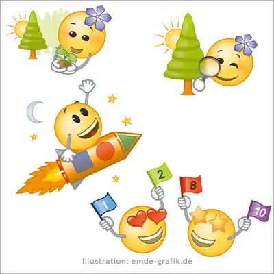
Vignettes: Maths for kids
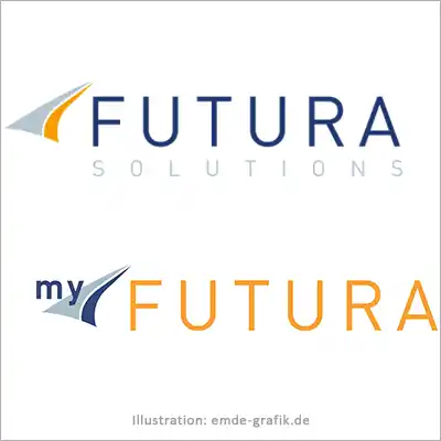
Company and matching product logo
Get logos, icons and pictograms developed by an illustrator: Why A.I. and freelancer portals are not enough
Logos and pictograms stand for the identity of your company. They are the first thing customers perceive about your brand. Therefore, they play a crucial role in forming a first impression. In light of technological advances, some might argue that artificial intelligence ( A.I.) or freelancer portals are enough to create a high-quality logo design.
Key points in the design
A logo is not a decorative object. It embodies the values, mission and vision of your company. As an illustrator, I take the time to understand your company, its culture and its target group. This intensive analysis leads to a logo that respects the laws of colors and shapes and also reflects the emotional identity of your company. Neither A.I. nor Clickworker can do either.
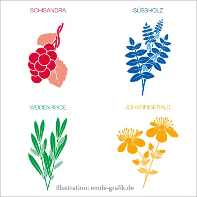
Vignettes of stylized medicinal plants for a cosmetic product
Logo for a coaching company
Icons for patient brochure
Creativity not algorithms
While A.I. is based on data and algorithms, human creativity is built on experience, intuition and emotion. An illustrator can take risks, set trends and create unique designs that stand out from the crowd. An A.I. follows predictable patterns that lead to generic results.
Communication is the key
The cooperation between my clients and myself is a dynamic process. There are feedback loops, discussions and iterations that help shape the perfect design. On freelancer portals, this communication can often be shallow. With A.I., it’s completely missing.
Icons for infographic:
Navigation system
Read more under „Featured projects“
Software applications for automotive technologies
Icons: Interactions of the guilds of the Chamber of Crafts
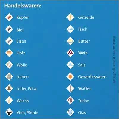
Historical map legend: The Hanseatic League’s trade routes

Design of vignettes for work instructions for a textbook
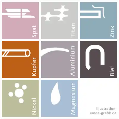
Vignettes: Charakteristics of different materials
Customization
As an experienced illustrator, I respond to customer feedback. I consult with my customers about desired customizations based on my knowledge of the company. An A.I. does not have these skills.
Conclusion
While A.I. and freelance portals have their advantages, they cannot replace the depth and breadth of human creativity and intuition. An illustrator’s intensive engagement with a client and their business is essential to create a logo that is truly representative and memorable. It is worth investing in this human expertise.
Frequently asked questions about logos, icons, pictograms, or vignettes (FAQ)
What is a logo, an icon, a pictogram, or a vignette?
Logos are usually a company’s or product’s identifying mark. As they must represent the identity of this company or product simply and unmistakably, they are, so to speak, a “supreme discipline” of illustration, because here an entire company and what it stands for must be expressed with just a few lines and areas.
Icon, pictogram: These terms are often used synonymously, although in German-speaking countries pictograms are often understood to be very simple representations of people, e.g. the traffic light man or the famous toilet sign. Icons are very simplified processes, objects, functions, etc., which guide the eye and make it easier to make decisions.
Vignettes have a decorative character and can appear as decorative elements on wine or cosmetics labels, for example, as well as in book printing.
What do I need to bear in mind when creating logos?
A logo is more than just an image, it is an identity. Whoever uses a logo must recognize themselves in it, identify with it and feel comfortable with it. That’s why creating a logo is a process that takes time. For me as an illustrator, this means getting to know the customer, their company and their product; finding out what is special, what connects them, what is unique. Which colors fit, which style fits?
Once the customer has decided on a logo, I always give the following advice: leave it in the drawer for another week, then take another look at it. If you still say “Yes, I like it”, then it’s right. If not, then move on. Until you look at the logo with exactly this feeling. It’s not finished before that.
What do I need to pay attention to when creating icons and pictograms?
When it comes to icons and pictograms, one principle applies the most, the so-called “KISS principle – Keep Simple and Stupid”. This is because icons and pictograms should be clearly understood in a fraction of a second so that they can be used as a navigation or orientation aid. The best example: the running man at an emergency exit.
What do I need to pay attention to when creating vignettes?
First and foremost, that it is a real eye-catcher.
